Electronic charts are the future of modern marine navigation in both the commercial and recreational worlds. Some view this as a big step forward and argue that modern electronic systems can do a far better job of presenting all forms of data for the area being traversed. Electronic charts can show AIS targets, RADAR ARPA targets, and overlay weather information. Others view electronic charts as more noise, more open to interpretive error, and just about assured to crash and fail when you most need them. Clearly there are mitigations for many of these shortcomings, such as redundant electronic systems or simply carrying paper charts as well. What’s changed is that it’s no longer required to carry paper charts even on commercial vessels, and many ships are now sailing without any paper charts on hand. Whatever camp you might be in, electronic charts are rapidly becoming the norm. The transition is well underway and, rather than fight it, it’s worth us taking advantages of those aspects of electronic charting systems that are better, and attempting to mitigate the problems they might bring.
The most obvious step any of us can and should take is to ensure there is considerable redundancy on board. It must be possible to lose an entire piece of navigation equipment without losing access to charts. On Dirona, we have two entirely redundant navigation systems and the loss of either still leaves us with full charts and electronic aids to navigation.
But full redundancy is not enough. Unfortunately it is possible to lose all electronics at the same time due to, for example, an electrical fault that puts voltage into the intersystem communication bus (NMEA 0183 or NMEA2000). Arguably this isn’t likely but there is at least one condition that does happen frequently enough that we all must be able to operate through the risk: a lightning strike. Direct strikes to a boat are thankfully not everyday occurrences, but they do happen. Consequently all boats need to be able to operate through a total loss of every electronic device on the boat.
On Dirona, we have several spare GPSs that aren’t turned on in normal operation and one that is inside the boat safe, which forms a faraday cage. This should prevent damage to this device even if the boat is hit directly and the electronics on board are a complete loss. We also have all the parts to build another PC on board with a full copy of the primary data disks which should allow us to get back mobile if we lose both charting systems. We also have 3 different satellite communications systems on board, only one of which is always on, so we should be able to access external resources even after a direct strike.
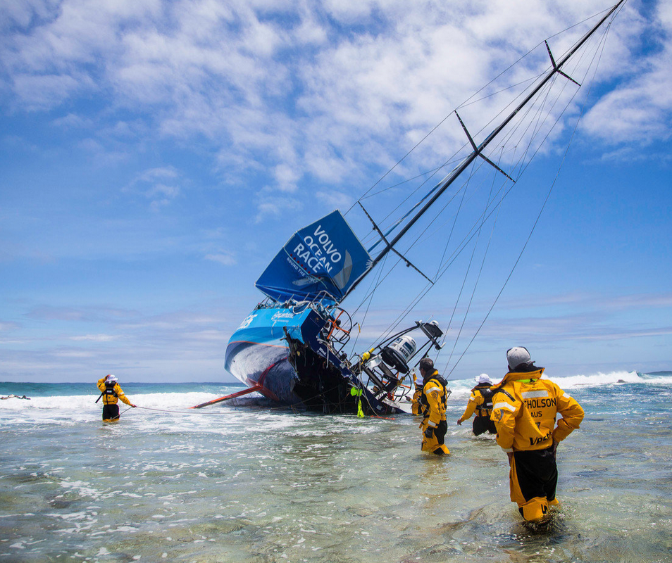
It takes thought to have sufficient redundancy after a move to electronic charting, but even that is not enough. Nothing shows that more clearly than how the 2014-2015 Volvo Ocean Race ended for Team Vestas Wind, with the boat lost on a large reef in the Indian Ocean. On board were some of the most experienced ocean sailors in the world. The captain was an Olympian sailor with 20 years professional experience. The navigator brought an extensive sailing resume with experience from America’s Cup, Admirals Cup, TP52 Med Cup, Middle Sea Race, Fastnet, TransPacific Cape Town to Bahia, two TransAtlatic races, and Sydney to Hobart. These are pros and yet their raced ended early on a reef in the Indian Ocean.
For those of us that cross oceans with lightly crewed boats, the loss of the Vestas Wind is a frightening event. It shows even the best sailors, using reasonable equipment, can make mistakes and underlines the possible negative consequences of a mistake should it occur. It’s terrible to see a beautiful carbon fiber boat lost, it’s tough to see a talented crew unable to finish their round-the-world race but, at least no lives were lost.
One thing that happens where there is an incident at the top of the sailing world is it gets looked at in detail and that is a real contribution to the racing and cruising community. The result of a very detailed investigation into the factors that lead to the incident has recently been published: Volvo Ocean Race Independent Report into the Stranding of Vestas Wind. Just as Feynman’s analysis of the space shuttle Challenger disaster as part of the Rogers Commission Report was a real contribution to engineering, the write-up on the Vestas Wind loss is a contribution to navigational safety.
The analysis into the conditions that lead to the loss of the Vestas Wind is detailed and worth reading for anyone interested in understanding the details of what can go wrong from a navigation perspective at sea. For those interested in the full details, I recommend the article itself. However, the most significant contributor were features and weaknesses in the electronic charting system. For users of these electronic navigation systems like ourselves, the report of the accident inquiry shows familiar faults and is worth studying for two reasons. First, these faults exist in many charting systems used on board recreational boats and we all need to understand the faults and come up with ways to mitigate the risks these faults bring. Second, because this investigation will be looked at industry-wide, it may lead to corrections of these problems and make it safer for all of us.
In what follows, I excerpt the most significant findings involving electronic charting systems and their use. For more detail, refer to page 45, paragraph 178 forward.
- The term ‘electronic chart’ is generic and could refer to any chart in one of several electronic formats made by either a national HO or a commercial company. Of the electronic charts there are two types of format: ‘raster’ and ‘vector’. Raster is relatively old technology that is being phased out by some HO and provides a scanned image of an official paper chart with exactly the same information as the paper chart. These charts require a lot of storage and the zoom in and out either magnifies or reduces the size of the fonts and features without providing more or less data.
- Vector charts provide a digital data format in which the charts are provided in a more schematic manner. The screen presents less information about land and other features and as you zoom in and out the information changes. As you zoom in more depths and details are displayed. Often as the scale of the display is adjusted the chart appearance changes smoothly and appears seamless. They present the data in a more user-friendly manner and most systems provide the ability for the mariner to manipulate the data to customise the display to what the navigator requires.
- Of the vector charts there are two different groupings: ‘official’ and ‘private’. The official vector charts have a specific name of Electronic Navigation Chart (ENC) and are produced by the national HOs around the world under the auspices of International Hydrographic Organisation (IHO). They are subject to very strict IHO standards and the quality and integrity of the data is guaranteed by a warranty. The primary customers are commercial shipping of the world and naval forces.
- The private editions come under several names for the same product and include ‘unofficial’ and ‘private electronic editions’. They are produced by private companies who are licensed to reproduce contents from the official paper charts, provided by government HOs, for use in chart plotters. The main market is an affordable product for the world’s fleets of recreational boats. The chart information is digitised and prioritised to be placed into the vector format in several overlapping levels each with a different amount of detail corresponding to a different range of scales. These are very challenging and important processes that involve dealing with vast amounts of data.
- The private companies also draw on other sources of data where paper charts are either not available or are known to be inaccurate. Other sources include privately created charts, aerial and satellite imagery, Coast Pilots, digital databases of depth information, and private surveys. Generally these additions fill in areas that are popular for recreational boaters but not important for commercial shipping. As discussed at paragraphs 130-131 private charts are accompanied by cautions and not considered suitable for navigation without reference to official navigation products from the HOs. There are no commonly agreed standards for the transfer, prioritisation and display of data between the various commercial products.
- Private chart suppliers attempt to faithfully capture all of the information that is present on the official source charts. C-Map’s practice is to ‘tile’ adjacent charts together to give a seamed chart presentation that has 100% coverage. The private edition suppliers control how cluttered or sparse the information presented to the user is by providing several layers of charts to the hardware or software providers. Each layer covers a range of scales and with different levels of detail – small scales, large area, less detail – large scales, small area, more detail. A user may be able to zoom in once or twice or more, on a single layer or level, but the information shown is simply diluted in density and covers a smaller area.
- As the electronic chart displays are ‘zoomed in’, digitized versions of larger scale source charts are shown on the display. In many cases large and small scale chart data are shown simultaneously in adjacent tiles which make visible the different cartographic standards on the two charts, as well as different densities of information. […]
- Chart display software systems allow the user to select various layers of data to overlay. The user can also de-select certain sets of data to simplify the presentation of especially dense charts. Unimportant features may be eliminated in favour of navigationally important ones, such as navigation aids, reefs, shorelines, traffic schemes and prohibited areas.
- Land features may also be simplified to reduce apparent complexity at the smaller scale/larger area presentations, to allow the navigator to focus on the important features. This is normally done by the chart vendor – the cartographer. The translation from a paper chart that may be close to 1m² in size to a small display that is 20cm across and which has far less resolution does present problems. As part of general navigation and passage planning, charts are often viewed on electronic displays at a small scale so that the “big picture” is seen. Due to the lack of resolution and area of the smaller displays, the cartographer must make decisions to eliminate details that are not deemed as important. This is referred to as prioritisation.
- The chart system provided to the VOR boats is a private edition, vector chart produced by CMap. […]
- In the specific instance of Cargados Carajos shoals, the C-Map presentation inexplicably omits the reef shoreline, drying areas, and land features at multiple chart scales. Using the scales according to Expedition software, the reef is not shown at Levels A or B or any magnifications of those scales and also Level C except for a glimpse of the reef at the southern tip of the shoals (Figure 14). What is shown instead is a large blue area corresponding to depths 200m or less, five spot charted depths, the name of the shoals and an economic zone corresponding to a 12 mile boundary around the actual landmass of the shoals. However, no land or reef is apparent. The land and reef are apparent on all scales of official paper charts reviewed by the report team.[…]
- This is no minor omission. It is not a small isolated danger. The north to south extent of the dangers and off-lying islands, between Albatross Island in the north and Coco Island in the south is about 36nm. The east to west spread is about 15nm creating a total area of over 500nm². The length of the eastern side of the reef edge is more than 35nm. The Cargados Carajos Shoals have been well known to mariners for many years and appear on charts dating back to the 17th Century.
- According to the navigator and the skipper, they looked at the area surrounding Cargados Carajos Shoals several times over the preceding days, and never comprehended that it was a source of danger other than the sea state might be worse due to the rapidly changing water depth. The lack of an apparent landmass at the scales at which they observed the chart (Figures 9 and 11) lulled them into a false sense of security. Following careful consideration of what they observed, it would be reasonable to conclude that the minimum depth of water across the shoals was 20m in the southern portion even though it was assessed at the time by the navigator and skipper as 40m.
- One of the features available on C-Map electronic charts is ’chart bounds’, which can be enabled or disabled. These are polygons surrounding areas where larger scale (more detailed) cartographic data is available. See the example at Figure 16; the small tic marks extend in the direction in which more detailed data is available. Chart bounds are well known among practising navigators as an indication of a danger or at least something that is worthy of further investigation. It is not known why the navigator and skipper did not increase the magnification of the region that was indicated by chart bounds to have larger scale data.
- A peculiarity of Expedition is that to obtain the detail available from the larger scale chart the user has to zoom in within the area marked by the chart bounds. For example, if a user zoomed in to the north of the shoals, outside the chart bounds, in the vicinity of the 46m sounding (Figure 16) to the highest level of detail (Level D/4), she or he would not access any more detail as it is not available. However if the navigator, at Level D, panned to the south so that the display was in the area marked by the chart bounds they would still not access additional data even though it was available. The user will only obtain the larger scale chart if they position the display within the chart bounds area at a smaller level (A-C) and then zoom in to Level D.[…]
- Vestas Wind ran into Cargados Carajos Shoals not because they were inaccurately depicted on official paper charts, and not because they were missing entirely from the C-Map database, but because they were not shown at several scales when the C-Map data was displayed on Expedition software (Levels A and B and most of C).
- In addition the route planning onboard Vestas Wind was ineffective and failed to respond to the indicators within the system. These included:
- chart bounds outlining the Cargados Carajos Shoals reef,
- the name Cargados Carajos Shoals is shown providing an alert to shallow water,
- the economic boundaries are shown, although when using the default colour pallet, they are difficult to see against the blue 200m depth area and can also be confused with depth contour lines, and
- at one location to the south of the shoals, a small piece of a larger scale chart can be seen at Zoom Level C.[…]
- The report team considers the cartography in this particular case to be deficient. The omission of the islands, reefs and dangers at display levels A, B and most of the C presentations of CMap data failed to fulfil the primary function of a chart and warn the mariner of a potential danger. When using a properly designed chart display system, navigators should be confident that land would be displayed at all scales. The expected reliance on chart bounds or economic boundaries to alert a mariner to a danger is not considered to be a sound practice or good cartography.
- The report team also considered that the panning feature on the Expedition software requires improvement so that if a user pans into an area of larger scale map coverage, that coverage is visible.
We do use C-Map charts on Dirona as our primary source of charting data. In some regions we also consult Navionics chart data. There are times when they differ but we haven’t seen a consistent trend with one better than the other. Our approach to at least partially mitigate the glaring weaknesses outlined above is to plot routes on the charts for the area we plan to cover. Then to traverse the route fully in a very detailed view. It sounds slow but it doesn’t take long and there are times when “clear sailing” at one resolution is “over the rocks” when scaled in.
Another technique we employ in an effort to avoid the problems describe here is we have both a full 19” display of chart data and a separate detailed view. Using a large screen help slightly in needing to scale out quite so far to “see the big picture.” This has some positive effect but it’s not sufficient. What is quite powerful is to have a second display that is showing 3.0 to 5 nm depending upon the area and we leave it at that resolution for the entire trip. That way, if we inadvertently have the big screen scaled out too far, we will still see the danger on the small display since it is not scaled in and out and stays at the same large scale display for the entire area.
There is no question that the combination of cartographer prioritization and how charts are rendered need to change to avoid the problems described in this excellent write-up. But, in the interim, we attempt to mitigate the problems by investing a bit more time in scanning a planned route and in always having a detailed (scaled in) display in front of the person at the helm.
More detail on the Vestas Wind incident:
After reading your post, as a private pilot and RV owner, a couple of things come to mind.
As a pilot, we have much the same concern, not wanting the bottom of our hull to scrape on any pointy things sticking up from below. Our VFR maps are lined with big squares and each contains a big red number of the height in feet of the highest “thing” in that square. So when plotting a course at 3,000 feet, tracing your finger across the map, you know quickly if you should drill down into the details of any square.
As an RV owner, I tell my Garmin, my RV is 12 feet, 9 inches tall. It is really 12’3” but a margin of error is always wise. The Garmin plots my “course” avoiding all the bridges that will sweep my air conditioners off the top.
Extrapolating this to chart plotting—and I apologize, I am not an ocean navigator, but I am a computer nerd—it would seem they can produce a vector plotting navigation computer to avoid this. The skipper enters 10 or 20 meters minimum draft. The database has pre-calculated the map into squares and knows the shallowest point. You enter a route and it checks to see if any “square” or adjacent square has anything at a depth less than 20 meters. Also hit a button and only things less than 20 meters in depth appear on the screen. How close does you plot line look to those red pixels? Should you drill down or change course?
Lastly, hook up the GPS, now the plotter knows where it is and where it’s going. Event as you change course to avoid a container ship, at 20-30 knots, as you change direction, it looks ahead for less than 20 meters and a red light and buzzer goes off.
I’m not sure in the days of digital data, GPS and computing power, why there isn’t a big red light and buzzer at the helm. If it goes off, wake the navigator and slow the boat.
What I would like to see is when scaling out maps to see larger areas the shallows don’t disappear as small dots but keep showing. Essentially in less precise, scaled out maps, keep showing dangers even if the features are actually very small at that scale. Something similar to what you describe on VFR charts would work well.
I think some navigation systems do support choosing routes that avoid risks but ours don’t and I’ve never seen one in use. It would be a useful feature. What we do is plot a course and then inspect it over the full route length scaled in. And when underway we always have one chart display (and one RADAR display) scaled in to see the details.
It strikes me that a chart plotter should analyze a planned route against its data base and display a warning if hazards are found within a predetermined range rather than rely on the vision of the navigator and the layer of data being displayed. It seems like a simple thing to identify programmatically if a course is planned near/through a lat/lon that contains a hazard or obstruction. I’m not suggesting that a system prevent a course selection based on these data but I would argue that some very simple algorithms could improve performance and safety.
There is no question you are correct. Where there is a hazzard in an area, then scaling out to larger areas may remove detail and precision but the obstruction should remain an obstruction rather than medium depth water. A small rock pinacle or a large reef shoud both show as an obstruction at less detailed scales.
Hopefully the analysis that has followed the loss of Vestas Wind will get electronic charting systems closer to this goal.
The Volvo Ocean Race has a very good website which tracks the progress of the competitors. It can be found here if you have not already discovered it:
http://www.volvooceanrace.com/en/home.html
Somewhere on YouTube there is a dramatic video of the moment the Team Vesta boat struck the reef – no link immediately to hand. Reading extracts of the report above, it is surprising that a professional ocean racing team had not identified this hazard before they set off. Usually it is the uncharted stuff that will cause a problem. This happened to the World Explorer, an expedition ship, which struck an uncharted reef in the Solomon Isles some years back – fortunately not when we were on it. We had been on it a couple of years earlier cruising between Fiji and Tahiti and the Master said at the time it was the uncharted reefs that were his biggest worry when sailing in out of the way places.
The latest report from the Volvo race is that the Dongfeng team`s water maker has packed up too!
I agree with you David it does seem impossible that a professional crew could hit something charted of this magnitude. Partially explaining the mistake is that at many scales, the hazzard, although massive, is uncharted. You really have to see this effect to truely appreciate it. When scaled out, the area is marked as shallows by ocean standards and shows a uniform aroujnd 150′. When you scale in and more details is displayed it shows as a very large reef. Clearly the navigoator should have known this and some responsibility lies there. But, for a charting systems to show “safe to pass” when scaled out is needlessly exposing operators to error. The obstruction should be clear at all scales and, as you scale in, the details should get more clear and the bounds more precise. To have a reef simply disappear when scaled out put boats and operators in needless risk.
There are mitigations and we take them but this incident shows that errors can happen to some of the best in the world.